Precision, connection and confidence—from design to delivery.
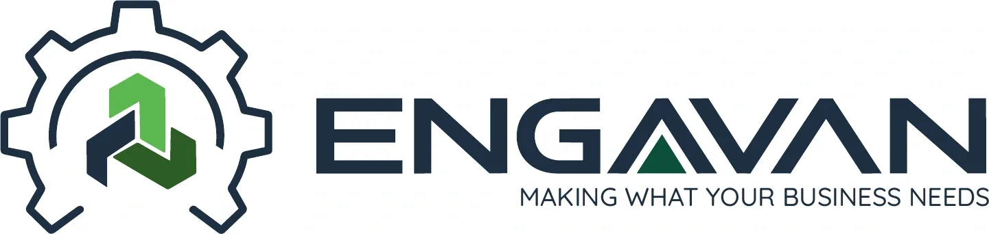
I developed an identity that makes a technical business feel modern, capable and approachable. The final system connects the engineering brief to a distinctive gear symbol, custom lettering and a considered blue-and-green palette.
Identity application concepts / stationery, digital, signage, vehicles and uniforms.
01 / THE BRIEF
Expertise with a client-focused promise.
Engavan connects clients in Canada and the United States with equipment manufacturing capability in Mexico. It coordinates engineering, suppliers and quality so clients have a dependable representative throughout the project.
The identity needed to communicate modern expertise, trust and client focus. Environmental responsibility was also part of the brief, expressed through colour rather than familiar leaf, globe or water-drop imagery.
Precision
The confidence of a technically capable engineering partner.
Connection
An accountable link between clients and manufacturing resources.
Responsibility
A grounded palette and a considered approach to long-term relationships.
02 / EXPLORATION
From machinery and networks to a stronger connection.
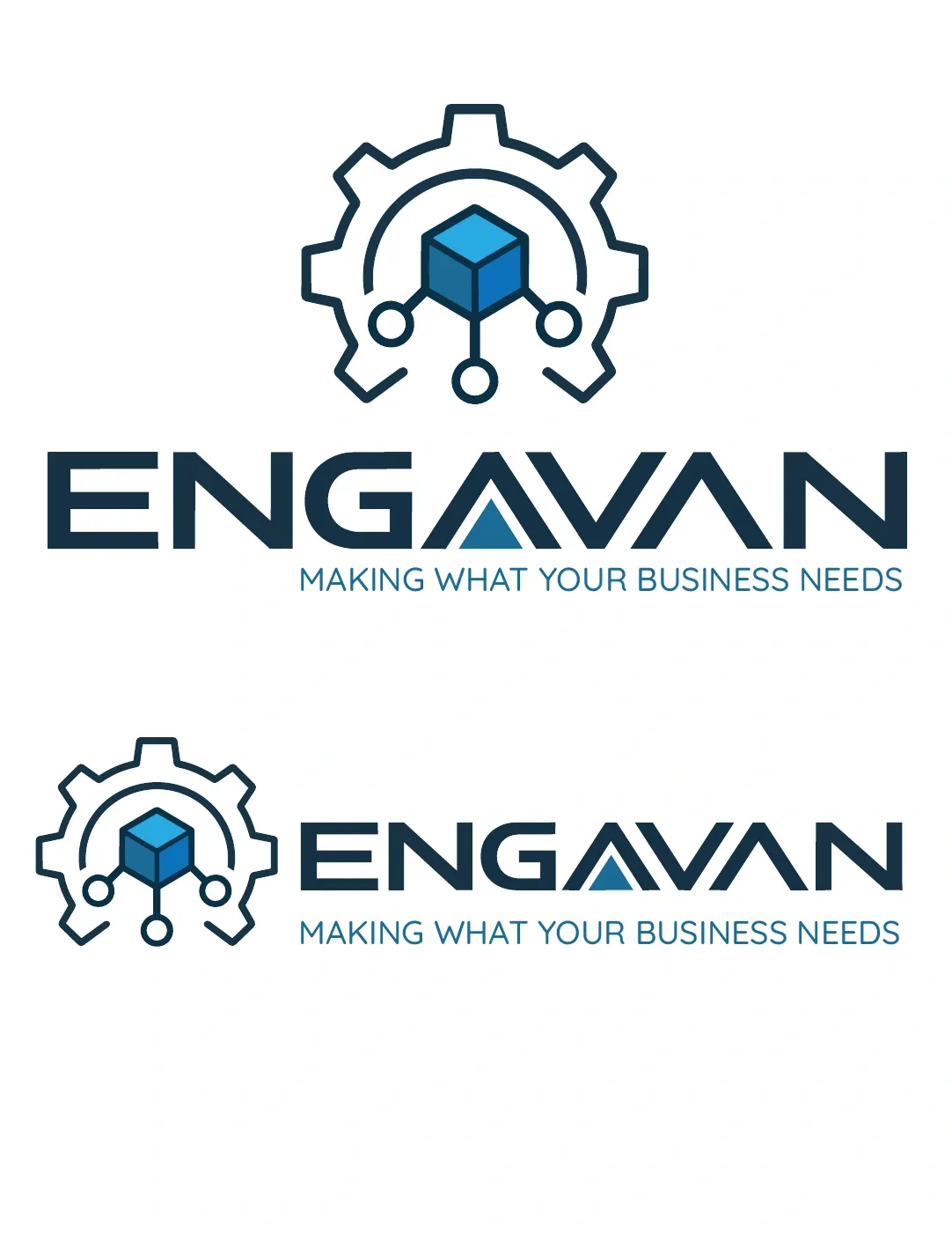
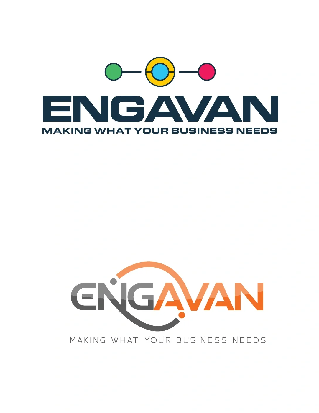
The first presentation explored gears, a dimensional cube and connected nodes. These routes linked the identity to equipment, manufacturing and a network of resources, while testing both stacked and horizontal compositions.
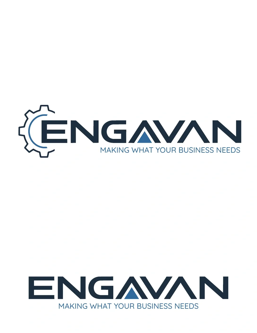
Stage 1 / gear, cube and connected network
Stage 1 / alternative initial exploration
03 / DEVELOPMENT
Refining the symbol—and its meaning.
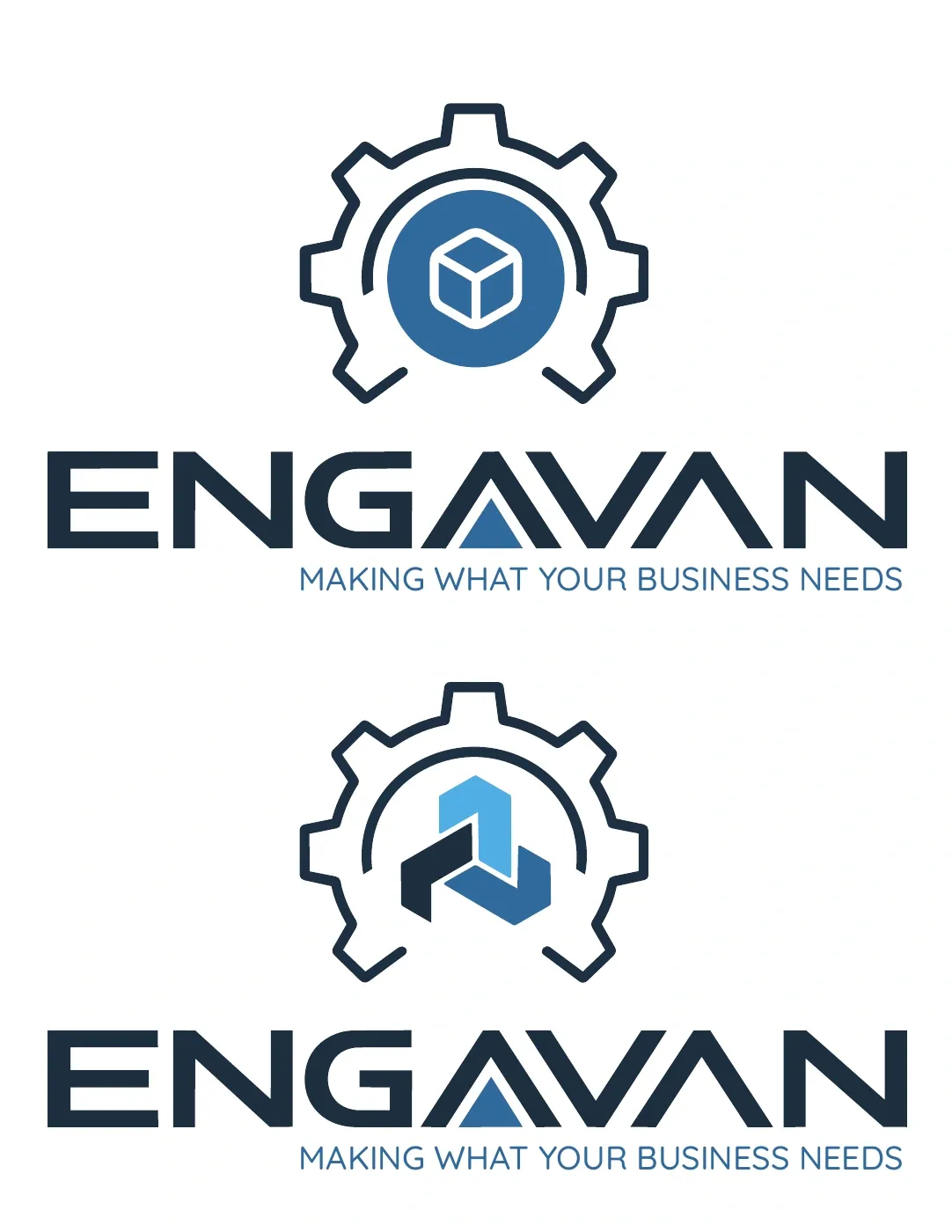
The second stage simplified the centre of the gear, comparing a cube inside a circular field with three interlocking forms. The final direction retained the engineering reference and made the connection between the three countries more abstract.
Stage 2 / comparing the cube and interlocking forms
Stage 2 / composition and colour refinements
04 / THE SELECTED IDENTITY
Built around precision and shared progress.
The gear
Mechanical movement suggests precision, dependability and equipment that keeps working over time.
Three interlocking forms
The central elements represent trade between Canada, the United States and Mexico, without relying on national flags or literal maps.
Blue and greens
Navy establishes trust and expertise. The earth-inspired greens express the environmental intent of the brand without conventional eco symbols.
05 / TYPOGRAPHY
A technical character with an approachable voice.
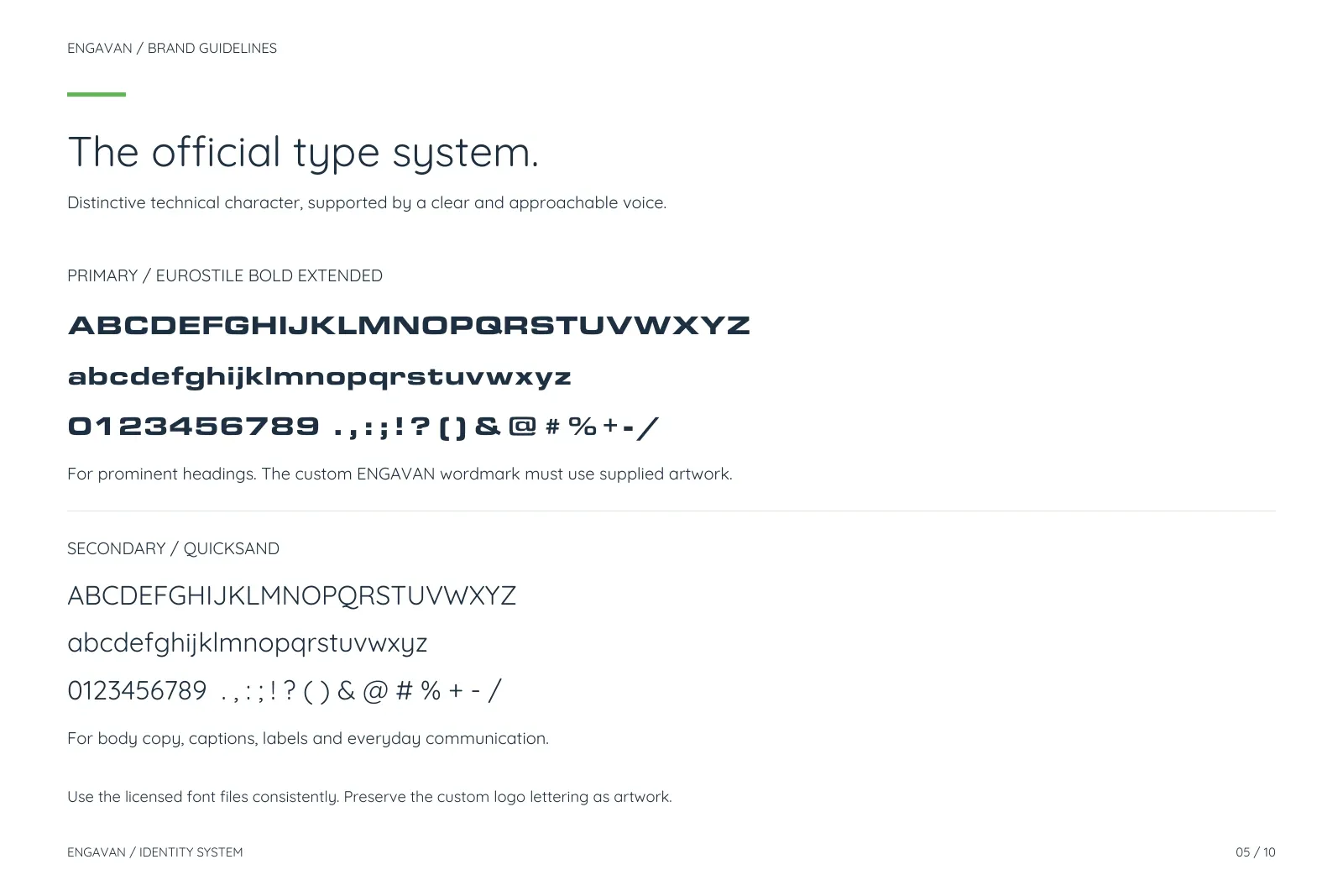
Primary / Eurostile Bold Extended
A wide, solid typeface establishes the technical character. Additional graphic treatment in the ENGAVAN wordmark gives the name its own recognisable shape.
Secondary / Quicksand
A clear, rounded supporting typeface brings an approachable tone to body copy, captions and everyday communication.
The wordmark is artwork, not live type. Its custom details are preserved by using the approved master logo.
06 / APPLICATIONS
A consistent presence, wherever clients meet the brand.
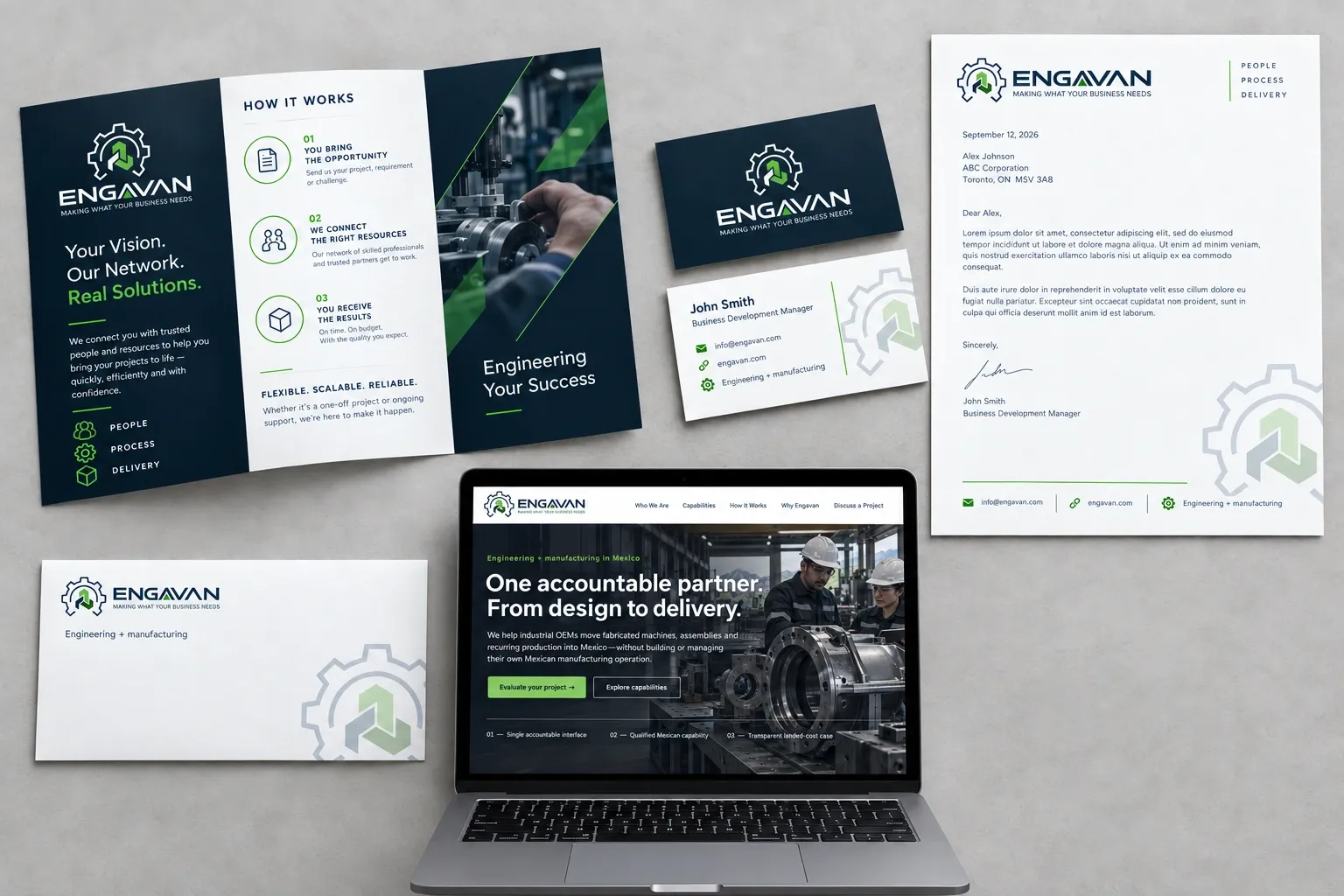
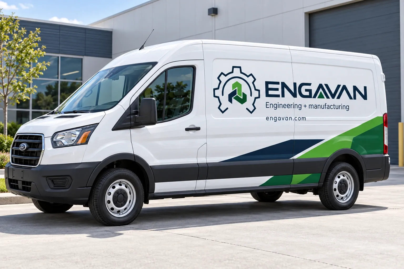
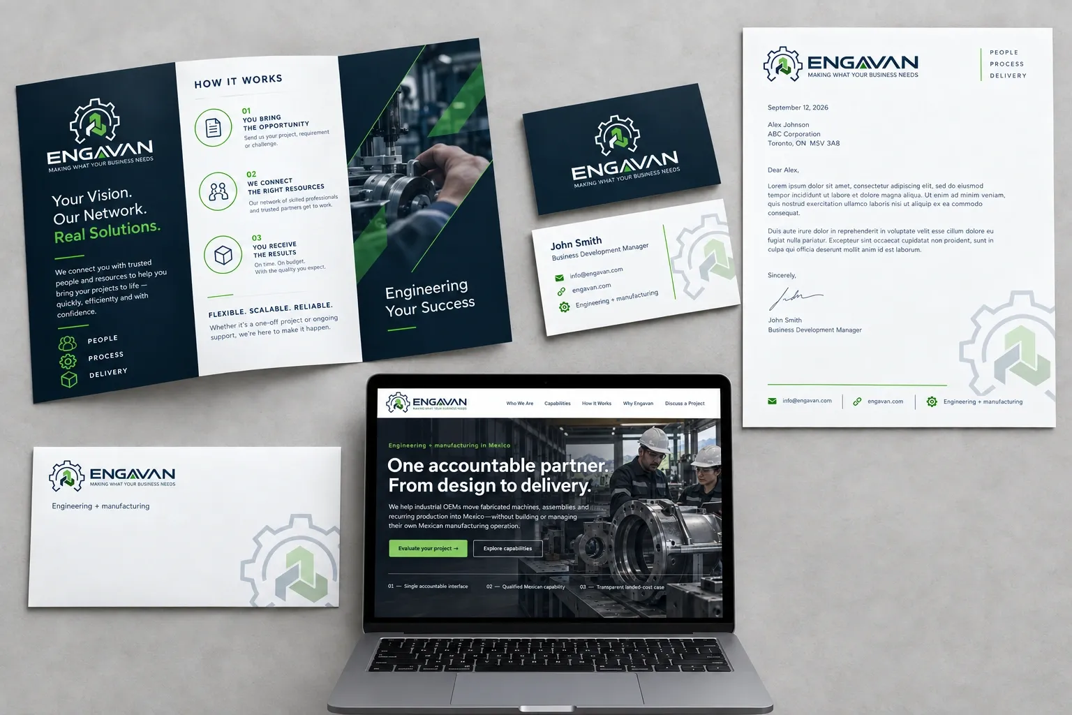
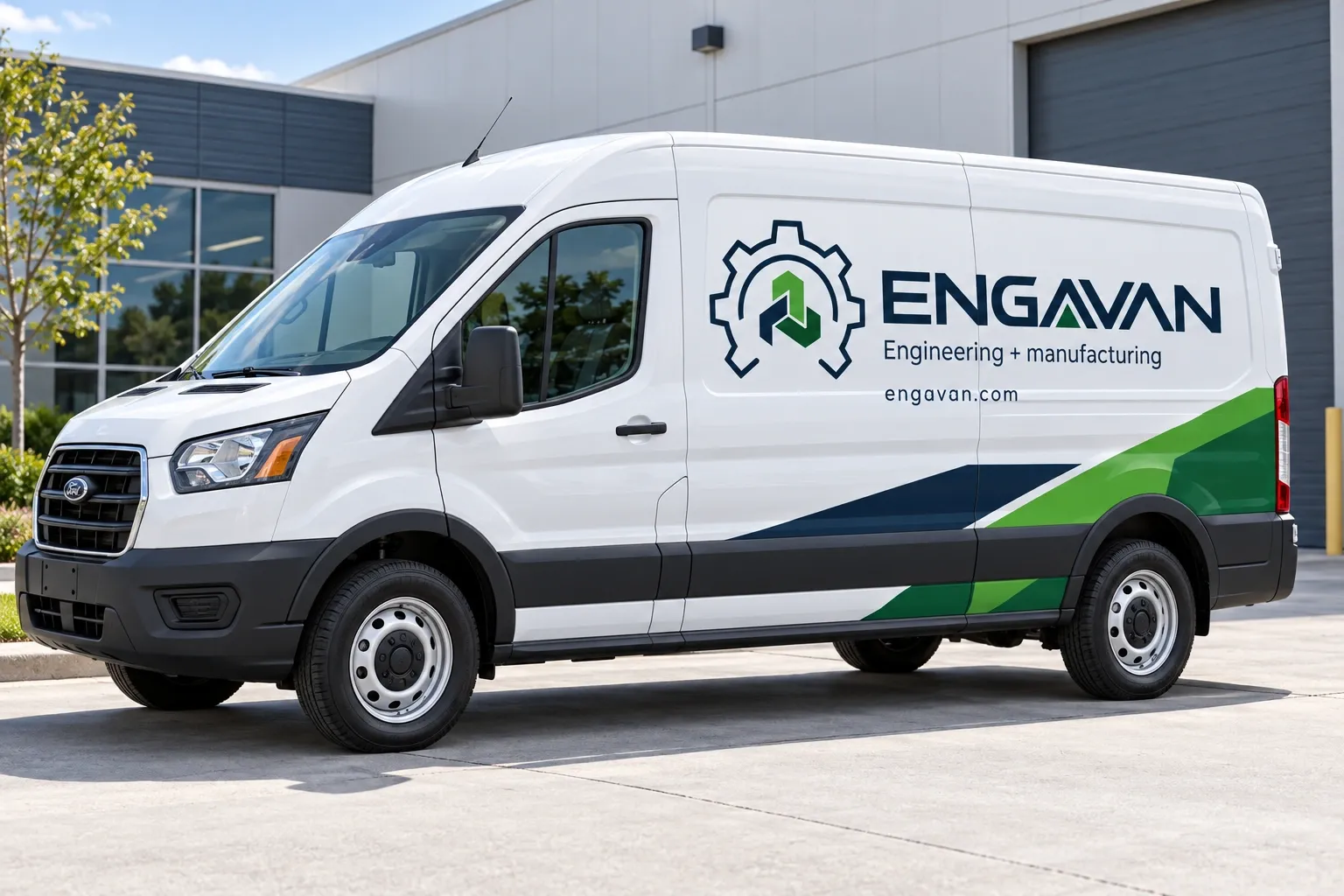
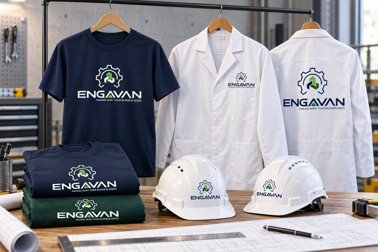
The identity carries from stationery and reception signage to service vehicles and the team’s working kit. These mockups explore how a restrained navy-and-green system can stay recognisable across different materials and scales.
Updated application concept / brochure, letterhead, business cards and envelope.
Service van concept / high-contrast logo and a restrained geometric wrap.
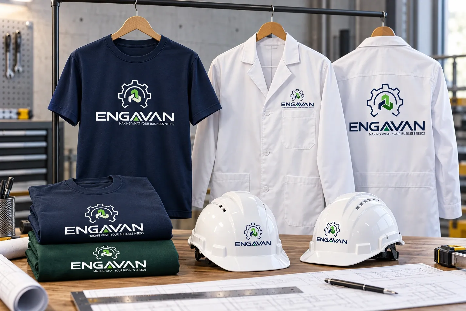
Uniform concept / T-shirts, white safety helmets and laboratory coats.
07 / THE DIGITAL EXPRESSION
One accountable partner. From design to delivery.
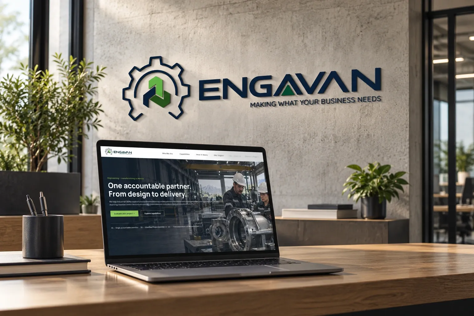
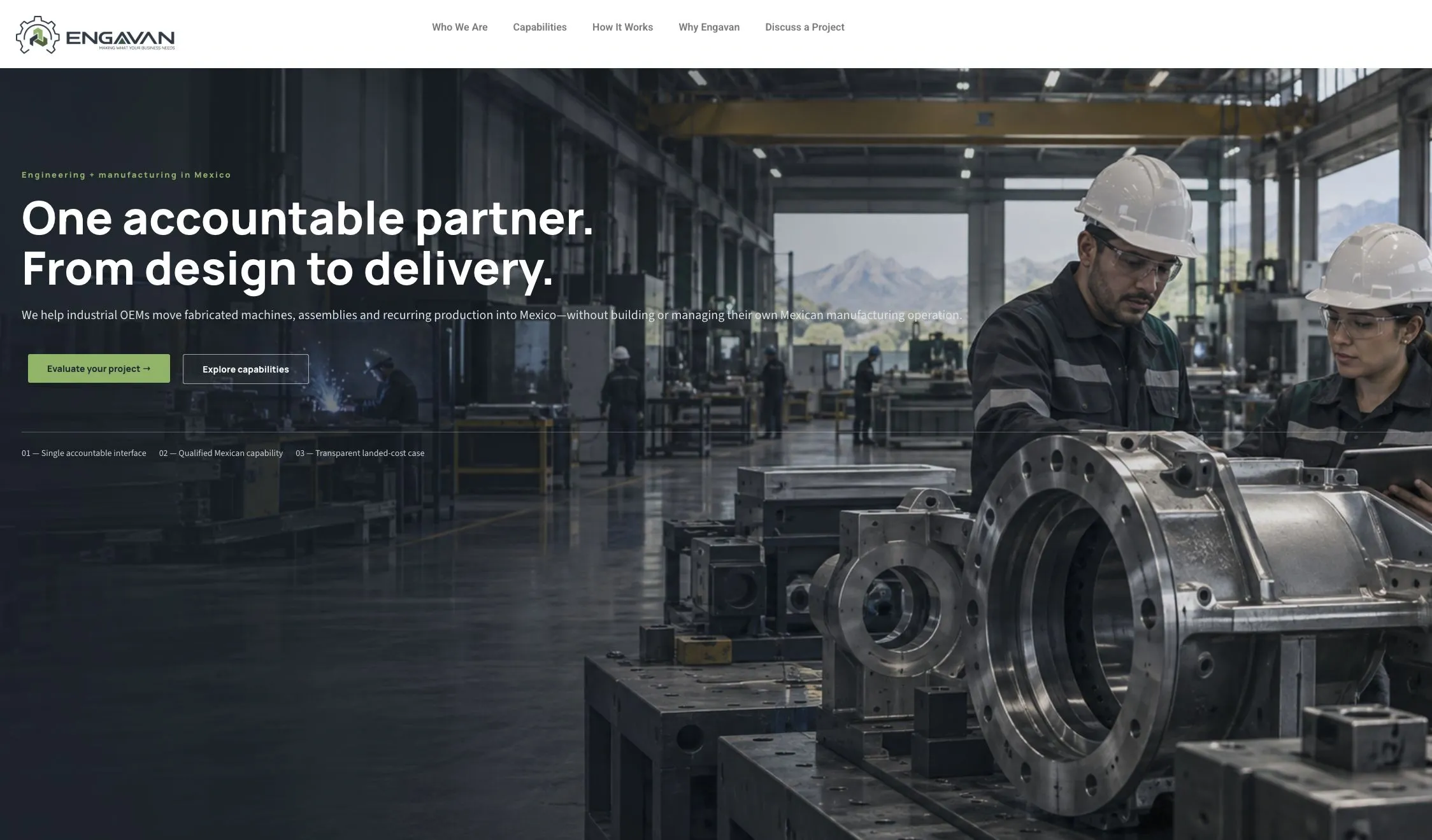
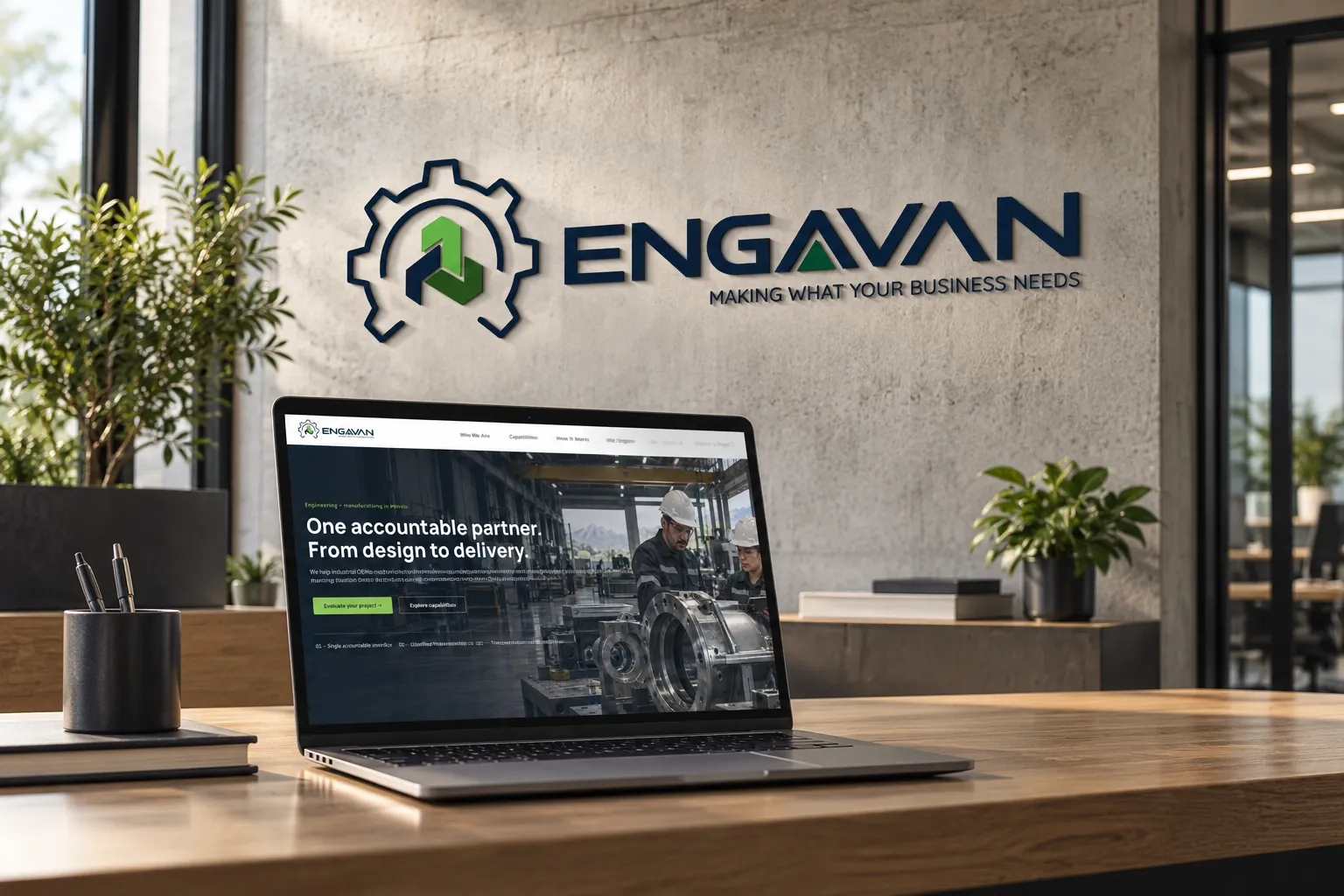
The live website extends the identity through industrial photography, a navy foundation and restrained green accents. Its clear hierarchy explains the client problem, Engavan’s capabilities and the controlled path from evaluation to delivery.
The actual Engavan homepage / captured from engavan.com.
Laptop and wall-sign concept / the website and identity in an engineering office.
A concise ten-page guide brings the visual decisions together: the meaning of the mark, logo layouts, colour, typography, clear space, incorrect use and practical production guidance. It gives the team and its suppliers a consistent point of reference.
Use arrows or swipe to turn pages. Click a page to enlarge.
Draft standards include proposed reproduction and clear-space guidance, ready to validate against final production proofs.
THE RESULT
A credible identity for an accountable partner.
The final system translates the brief into a modern, recognisable engineering identity: a precise mechanical symbol, three connected trading elements, treated lettering and a responsible colour palette. The case study shows the progression from initial exploration through refinement to an identity that can work across print, digital and physical applications.