A Toronto accounting firm needed a visual identity that expressed its position as the parent company: stable, knowledgeable and trusted to lead.
Malik & Associates
Brand Identity • Logo Design • Brand Guidelines
Creating a sophisticated identity built around trust, expertise and confidence.
I developed the identity from the first logo explorations through the final artwork and brand guidelines, translating the firm’s role as the parent company into a clear, practical visual system.
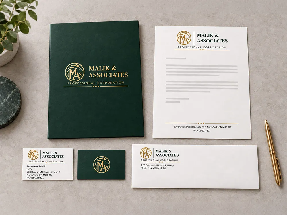
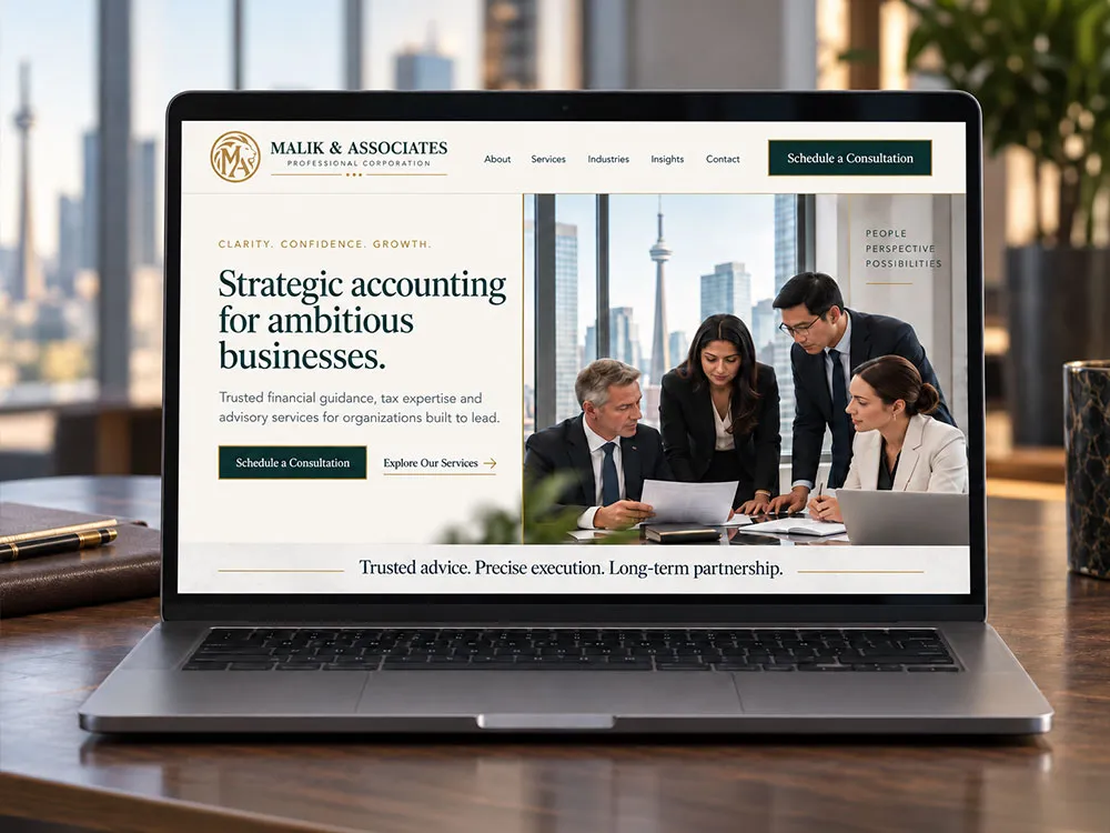
The mockups show how the identity can work across signage, stationery and digital applications.
01 / THE BRIEF
More than another accounting firm.
Malik & Associates serves major corporate clients in Toronto and is the holding company for three smaller accounting firms serving other sectors. The identity needed to distinguish the parent firm while communicating its responsibility for the group and its largest clients.
The client described the business as the “father” company. I translated that into three design priorities: stability, power and knowledge. The challenge was to express authority and protection while keeping the identity connected to accounting.
01
Stability
A solid presence clients can rely on.
02
Power
Leadership within the group.
03
Knowledge
Experience grounded in accounting.
02 / EXPLORATION
Testing different expressions of authority.
I developed several visual directions, exploring how typography, initials and composition could communicate the company’s position. The first presentation ranged from a distinctive serif wordmark to restrained monograms and more personal script treatments.
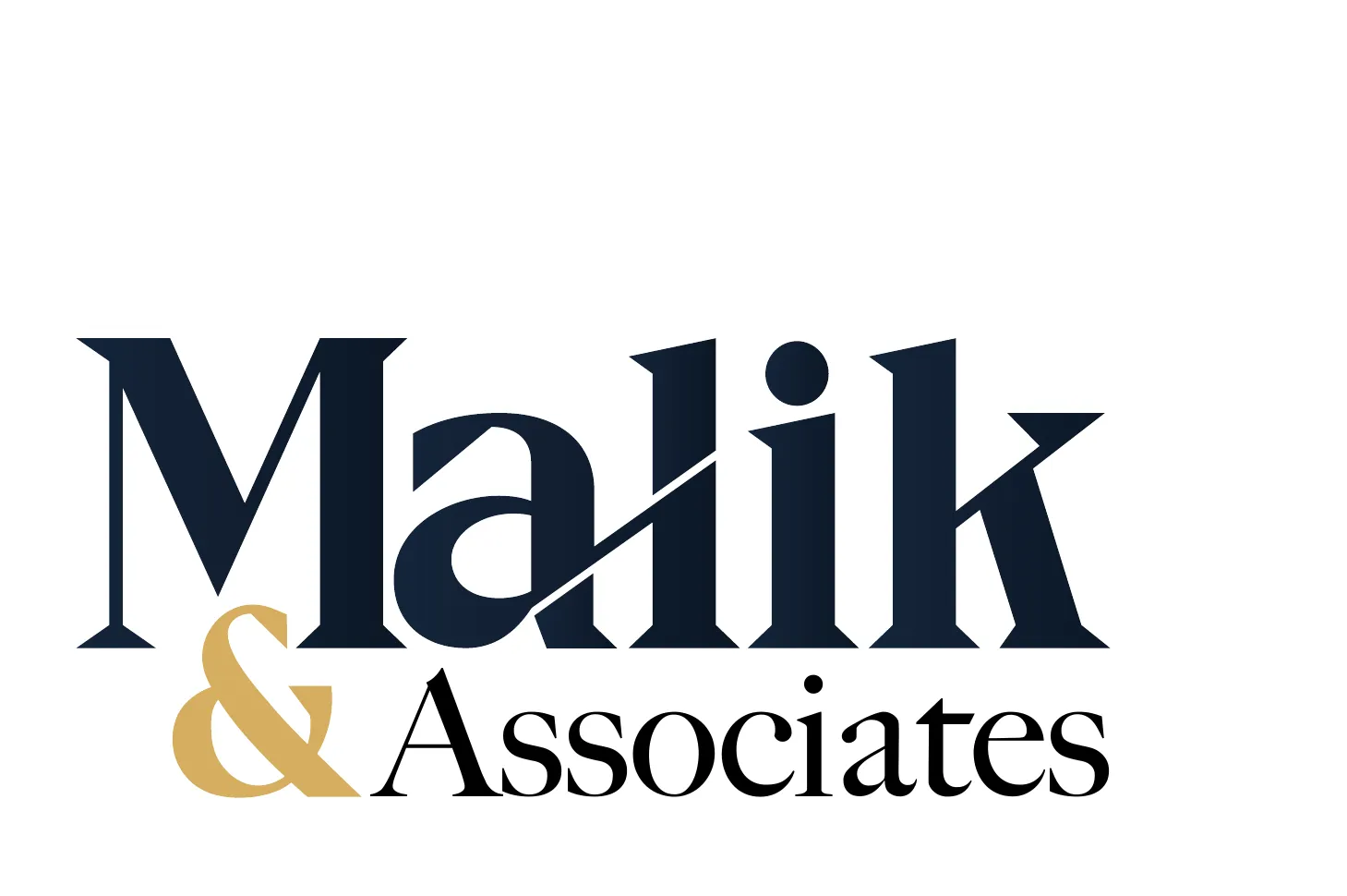
01 / Typographic presenceA prominent company name with a contrasting gold accent.
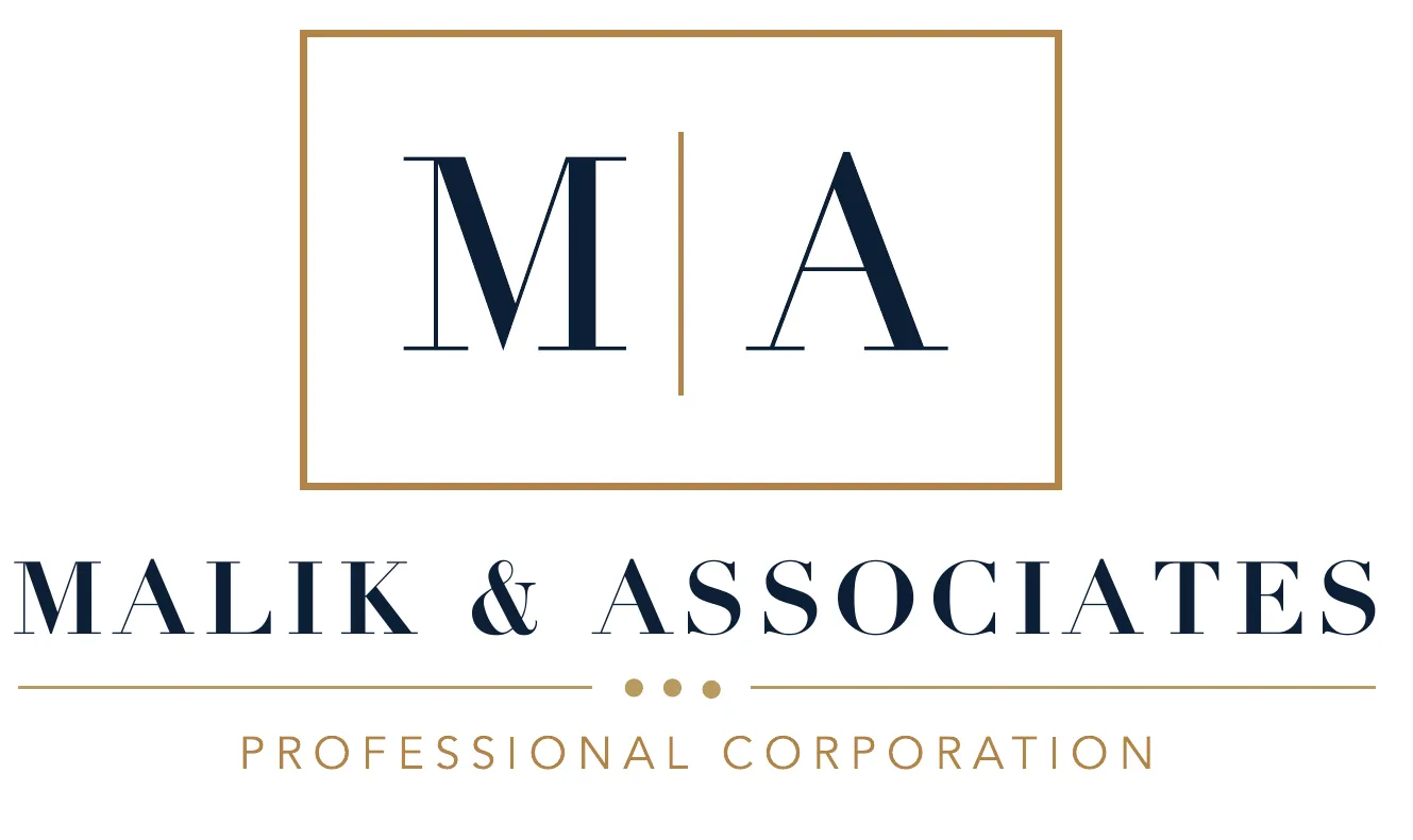
02 / Formal monogramInitials and a structured composition explore an institutional tone.
03 / Personal signatureAn expressive script paired with formal supporting typography.
04 / Signature symbolA compact initials-based mark with a strong name hierarchy.
Selected concepts from the original Round 1 presentation. These are exploratory routes.
03 / DEVELOPMENT
A symbol for the parent company.
The second presentation introduced the lion-and-MA emblem alongside simpler monogram options. The archive shows variations in the divider, descriptor placement and baseline details, testing how the symbol and company name worked together.
Lion-emblem refinements / Round 2
Why the lion?
I chose the lion for its associations with strength, respect and leadership. As the “king of the jungle,” it provided a clear metaphor for the firm’s role: a strong parent company that guides and protects the rest of the group.
Combining it with the MA initials made that symbolism specific to Malik & Associates.
Alternative monogram / Round 2
04 / THE SELECTED IDENTITY
Leadership with a financial foundation.
THE LION
Strength & protection
The lion expresses authority and the parent firm’s responsibility for the group. The MA monogram ties the symbol to the business.
THE CIRCLE & PALETTE
A connection to currency
The circular gold emblem recalls a coin. Green and gold reinforce the connection to money, wealth and financial stability.
THE BASELINE & THREE DOTS
An accounting reference
The line forms a solid base, while the three dots evoke an abacus—an early counting and arithmetic tool used to calculate quantities and keep accounts.
The abacus detail connects the identity to the firm’s accounting experience.
05 / TYPOGRAPHY
Designed for everyday consistency.
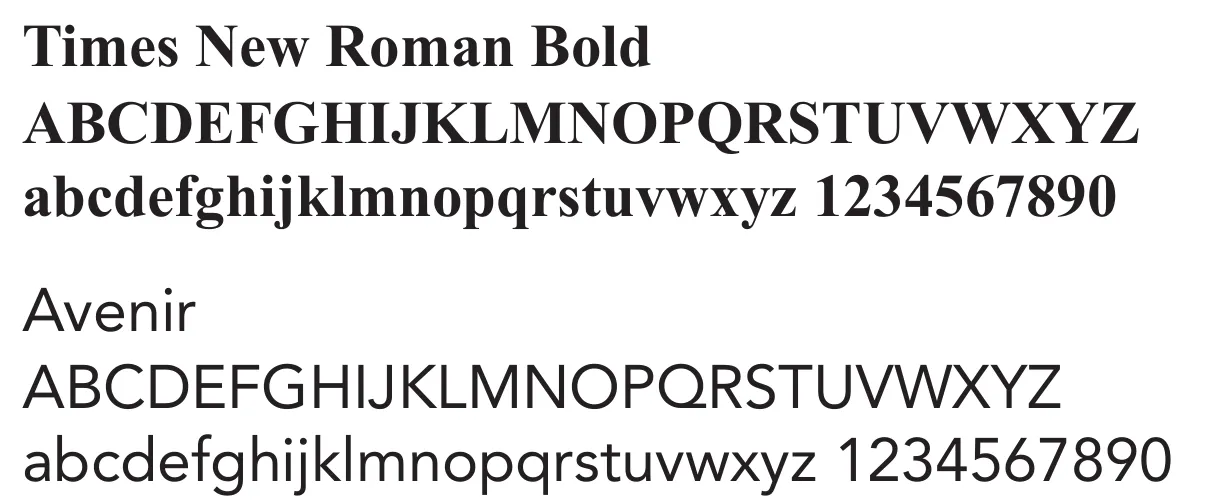
Primary / Times New Roman Bold
Strong serif lettering gives the identity a solid, authoritative voice.
Secondary / Avenir
A clear supporting typeface for body copy, labels and everyday communication.
The choice was practical as well as visual. I wanted a familiar font system that would make it easier for an accounting firm to keep everyday documents aligned with its corporate standards. Times New Roman is widely available; consistent installation of Avenir across the firm’s workstations keeps the pairing reliable.
06 / THE HANDOFF
From a logo to a usable identity.
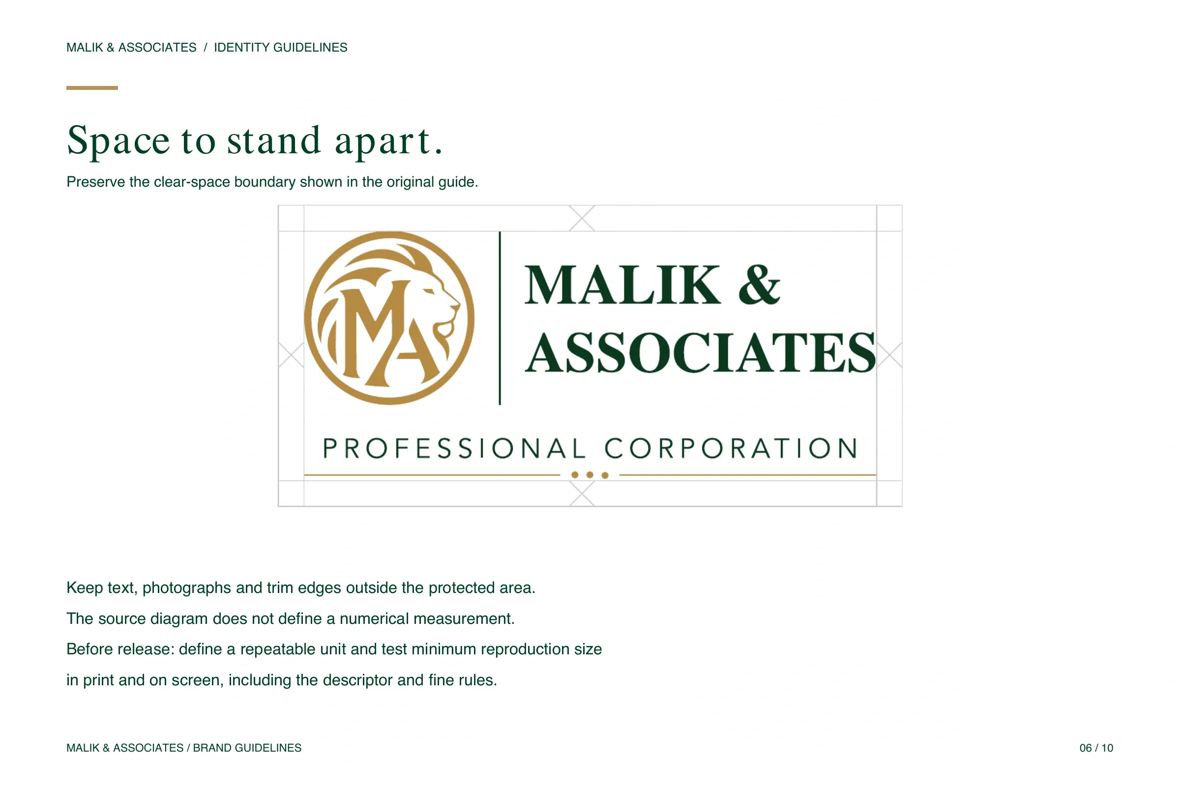
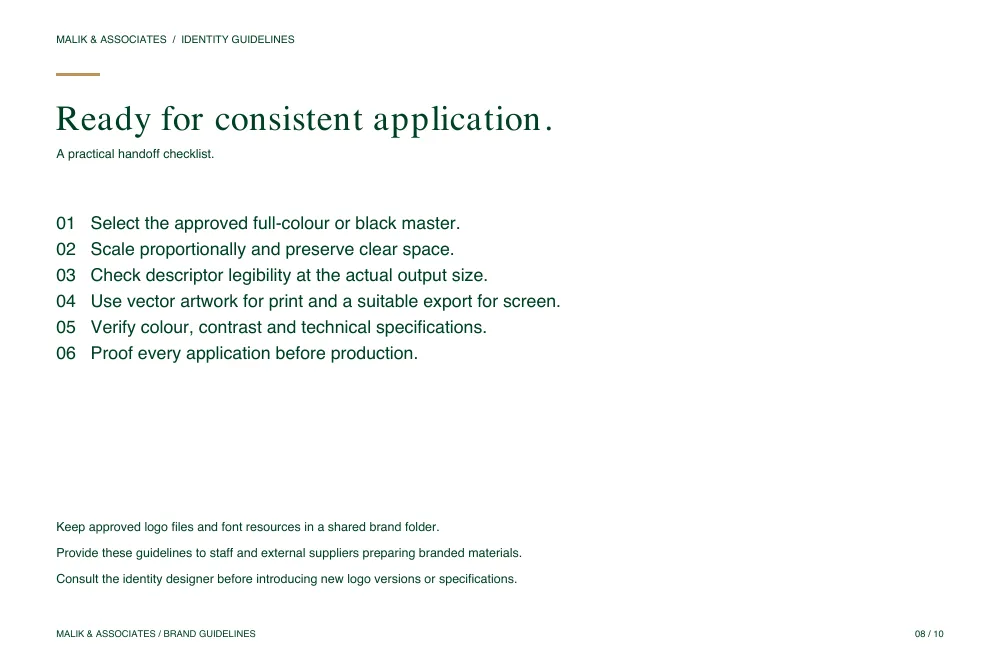
I brought the selected design into a set of identity standards covering colour, typography, full-colour and monochrome artwork, clear space and incorrect use. The approved ten-page guide gives the client and its suppliers a reference for applying the identity consistently.
Clear-space guidance
Practical application checklist
Use arrows or swipe to turn pages. Click a page to enlarge.
The final identity connects the business brief to a distinctive visual system: a protective leader, a currency-inspired palette, solid typography and a subtle accounting reference. The project demonstrates my approach from initial exploration through refinement and the standards needed to carry the identity forward.